If you are interested in commissioning typefaces of any kind; display faces, text faces, typewriters, signage faces or hand drawn lettering for an advertising campaign, a corporate font for your client, or any other bespoke type design for your project, then please contact us.

T: +44 (0)20 7739 4249
E:
info@a2-type.co.uk

A2-TYPE
5 Cotton’s Gardens
London E2 8DN
UK

Moesgaard

New identity for Danish Museum

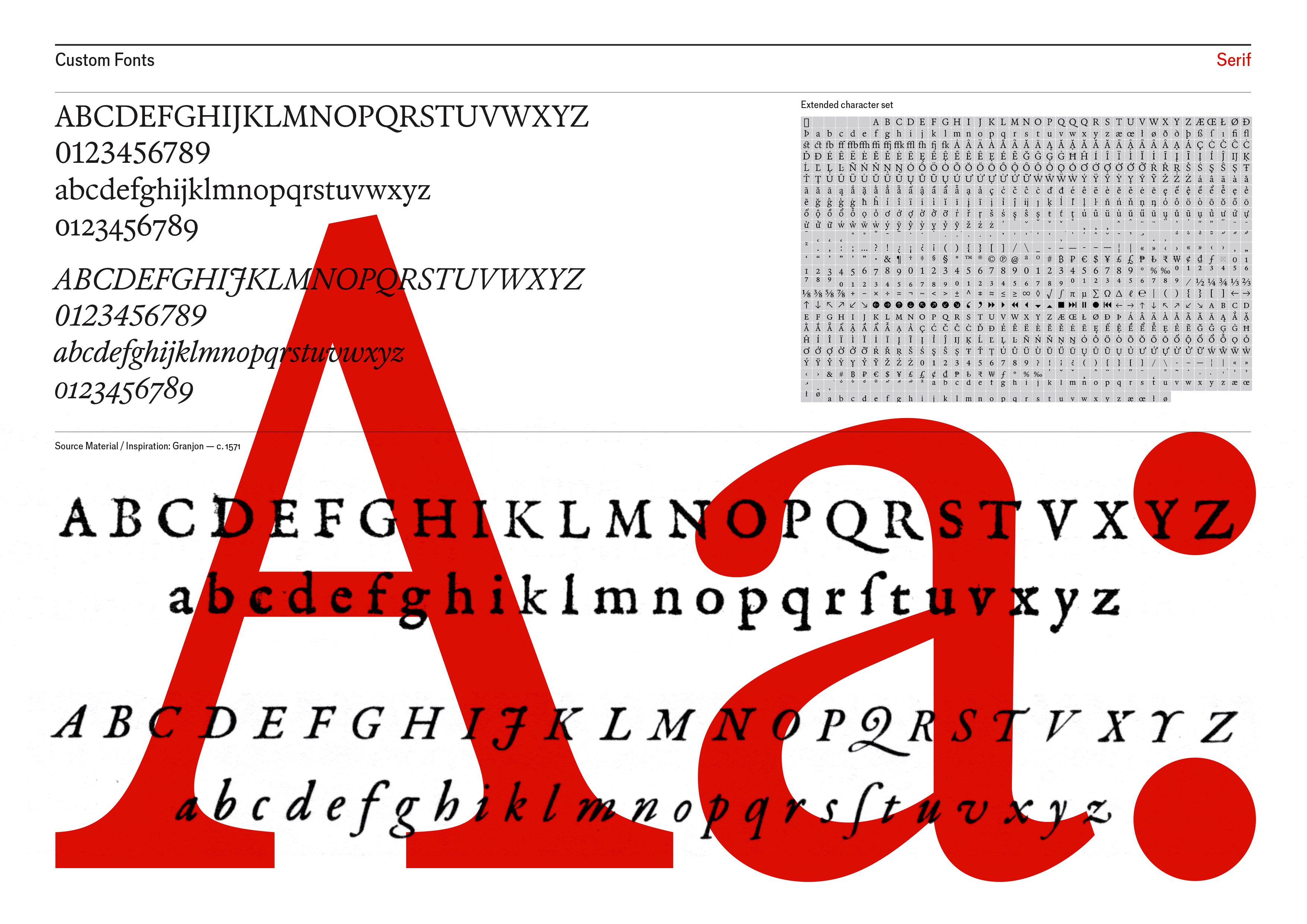
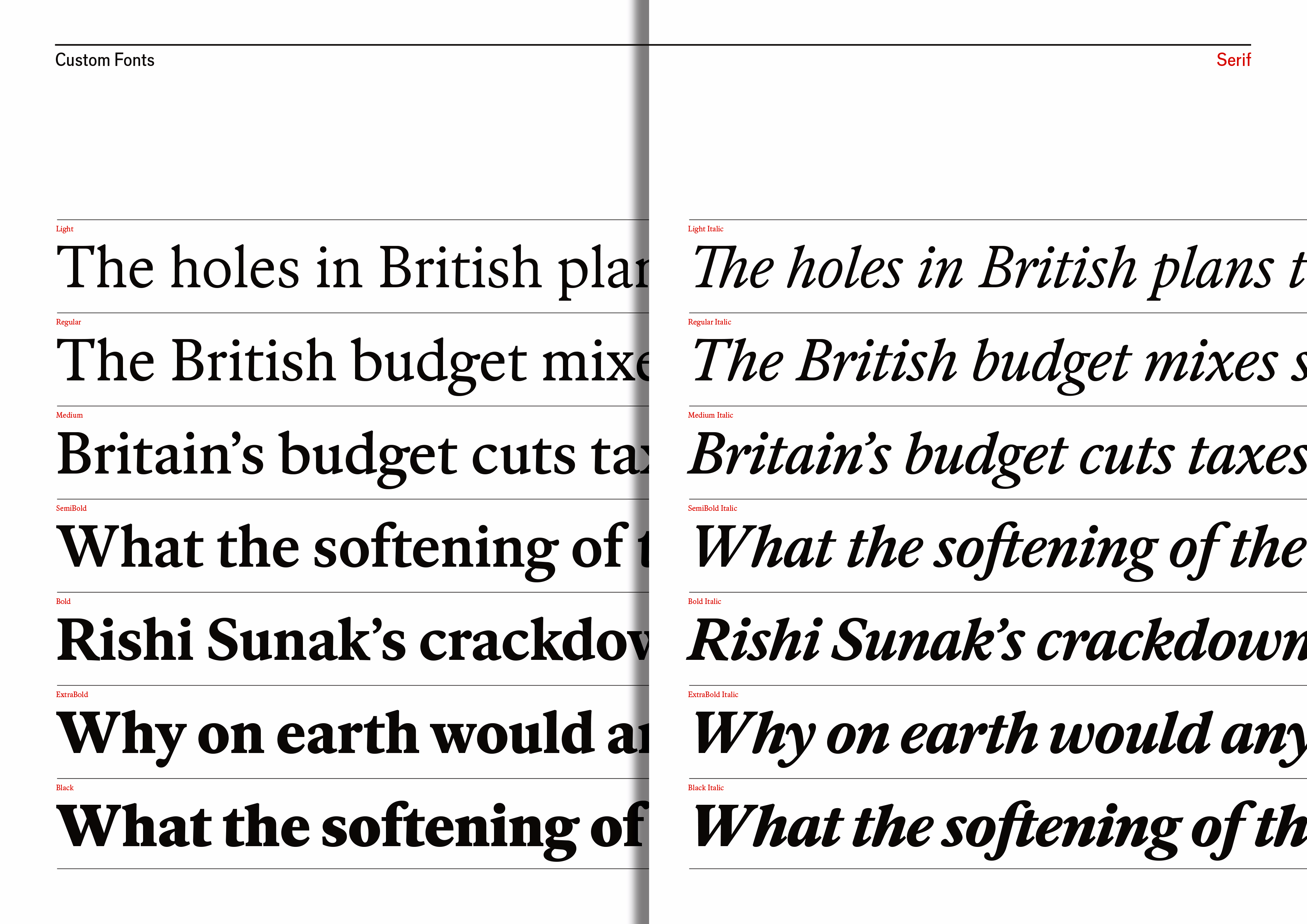
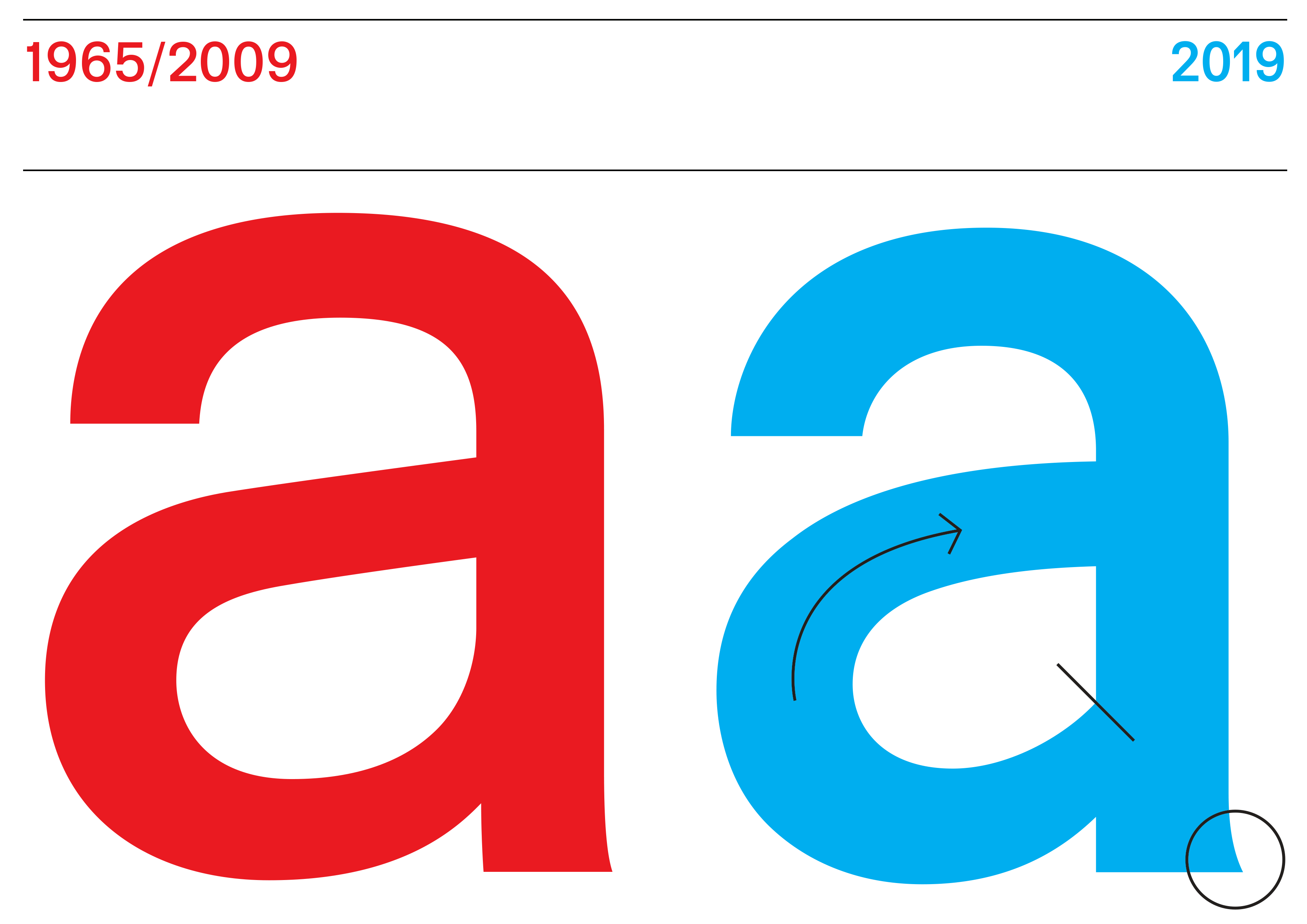
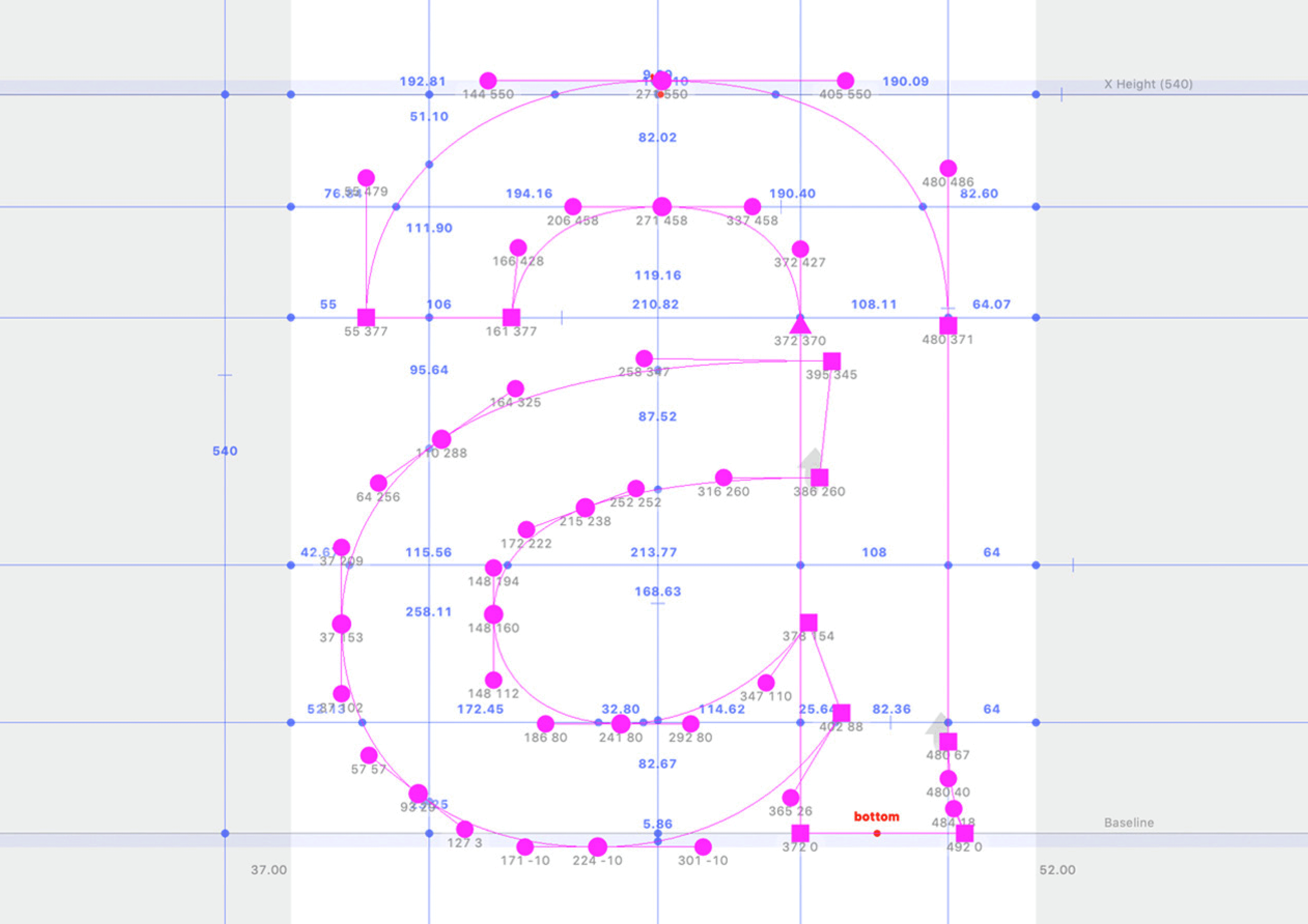
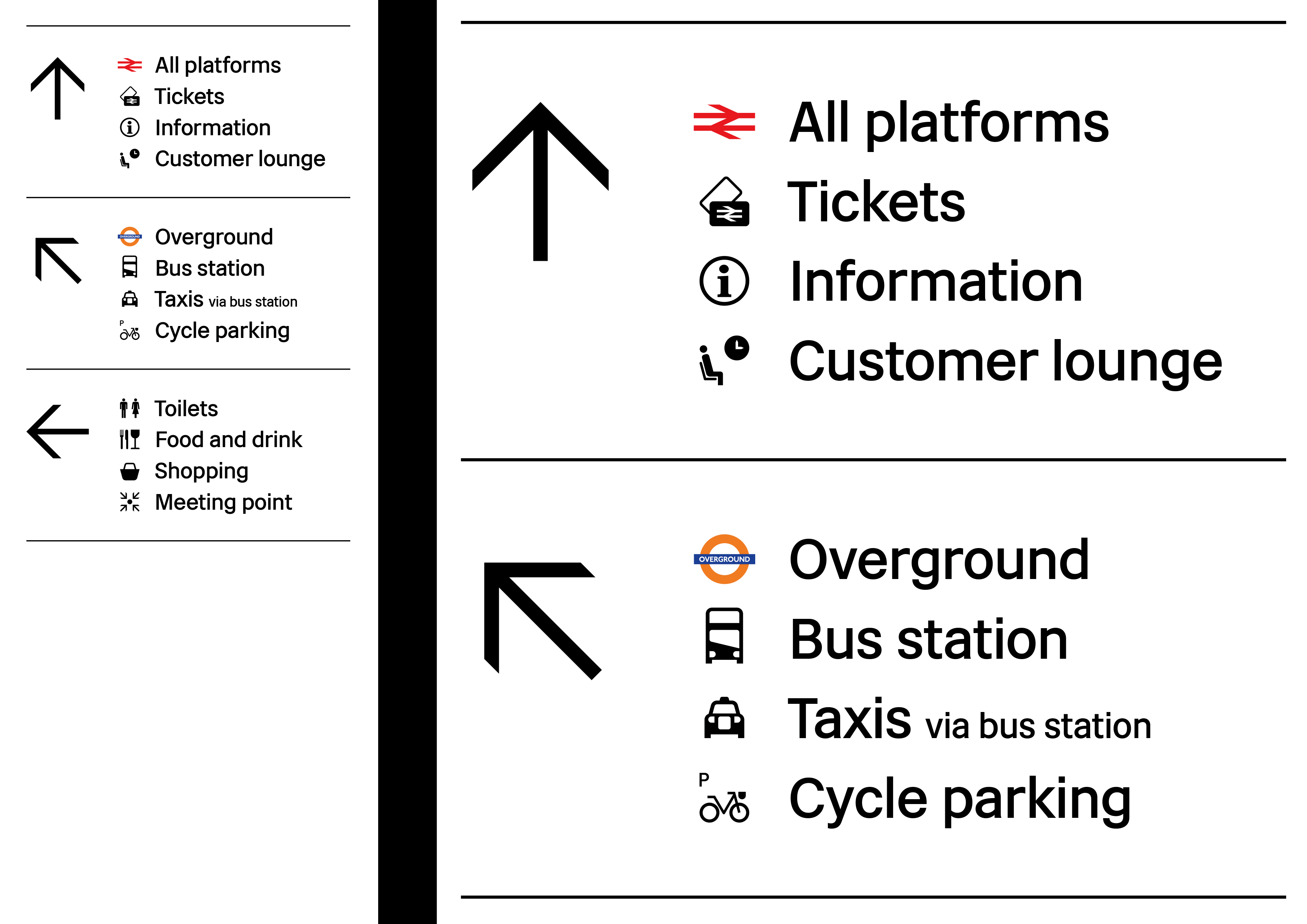
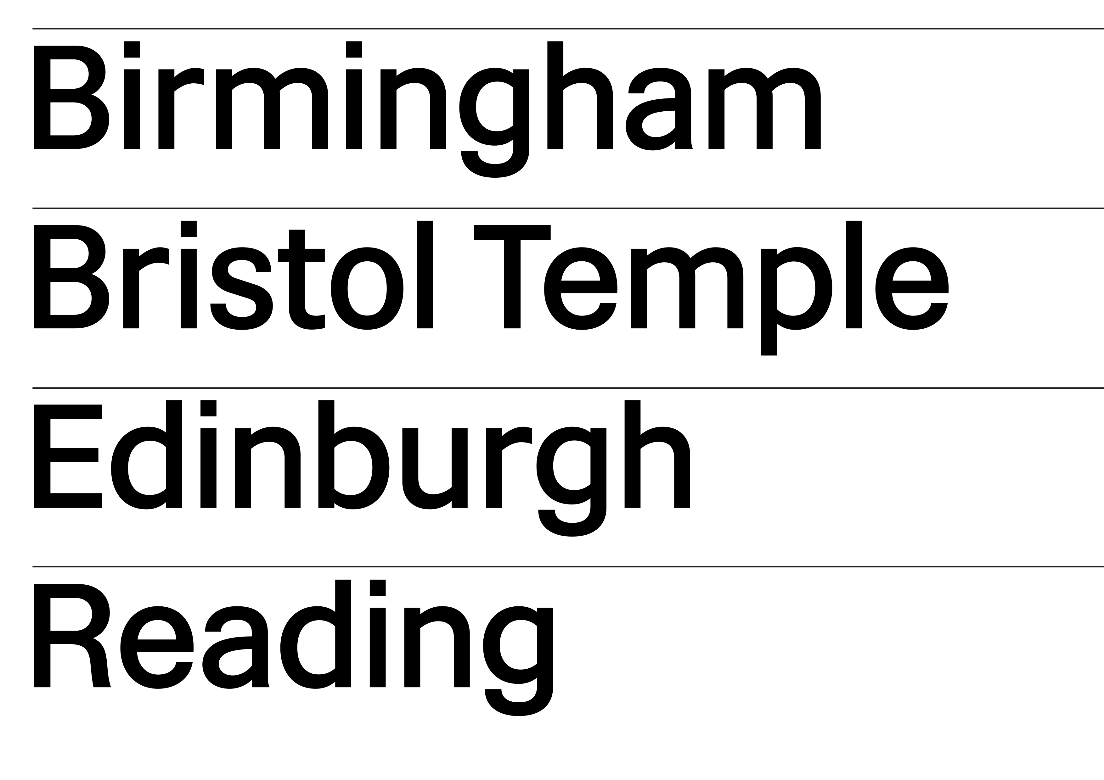
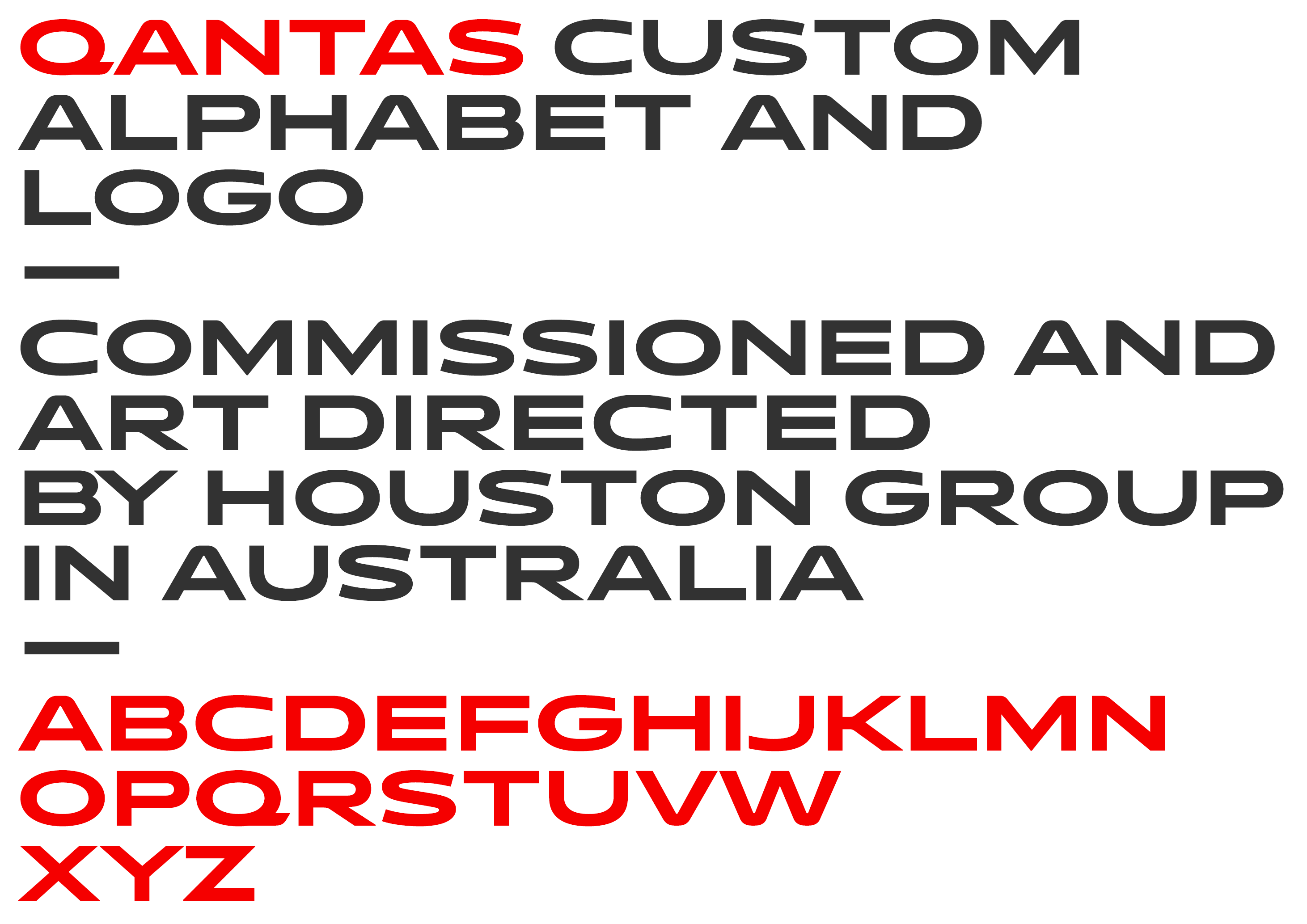
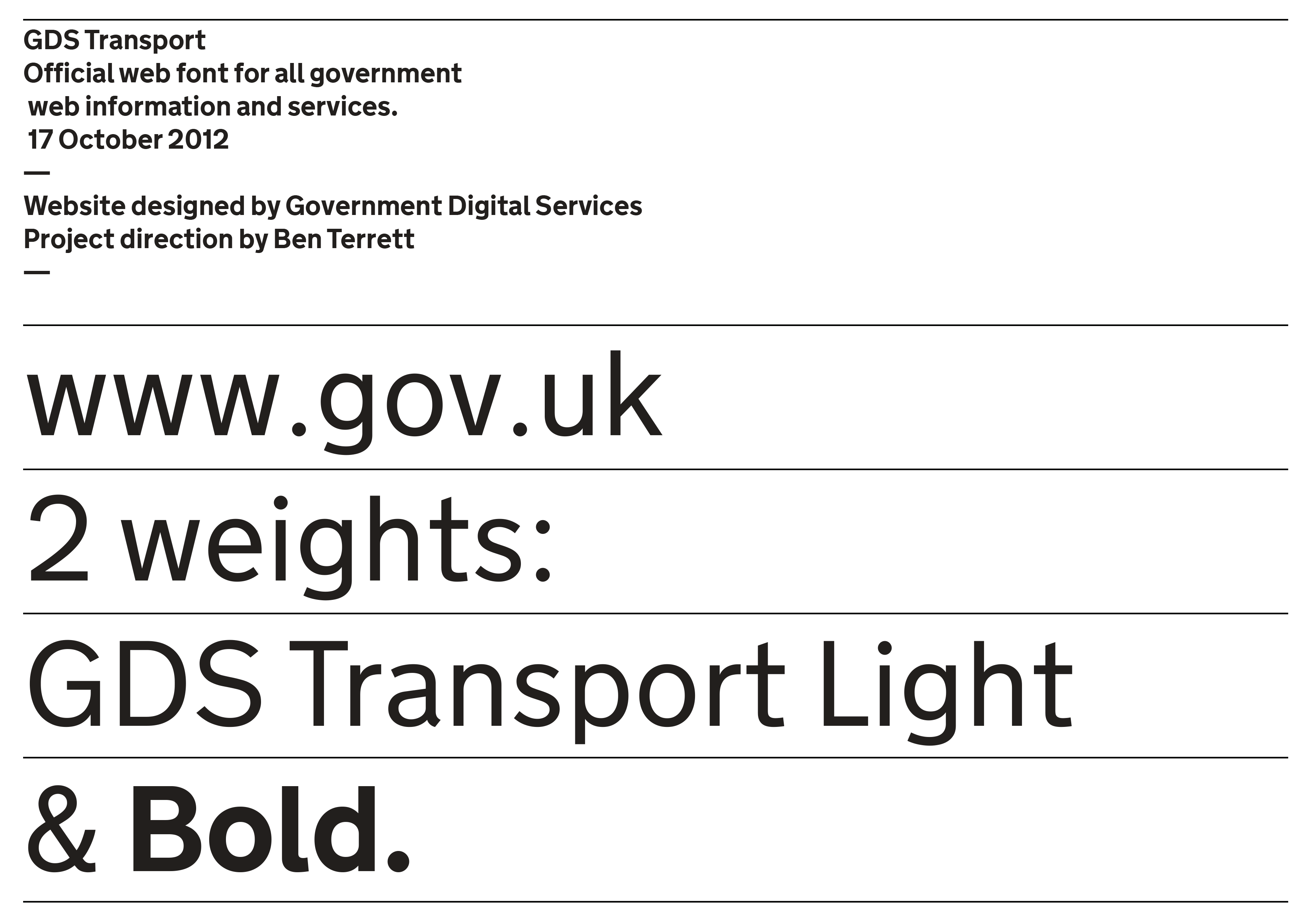
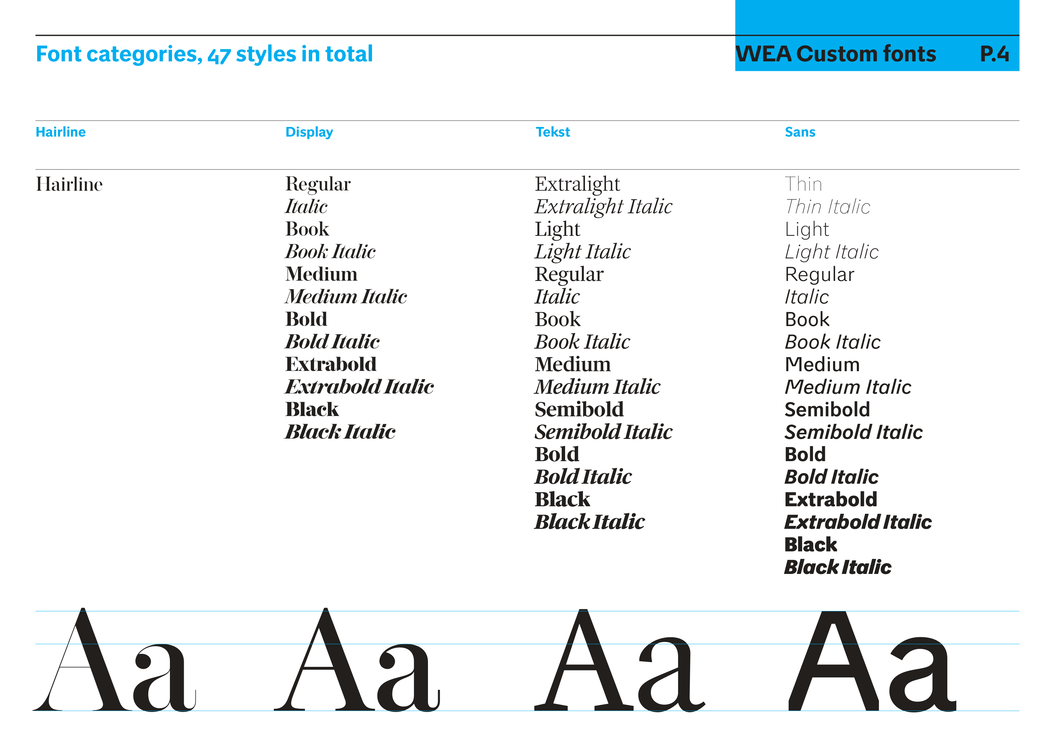
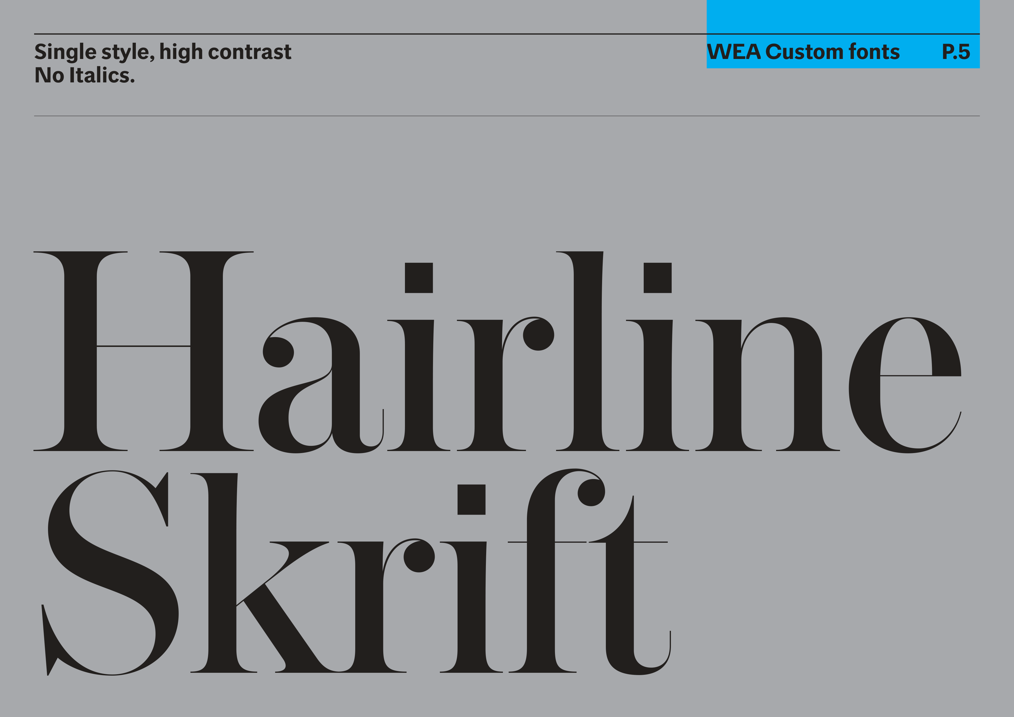
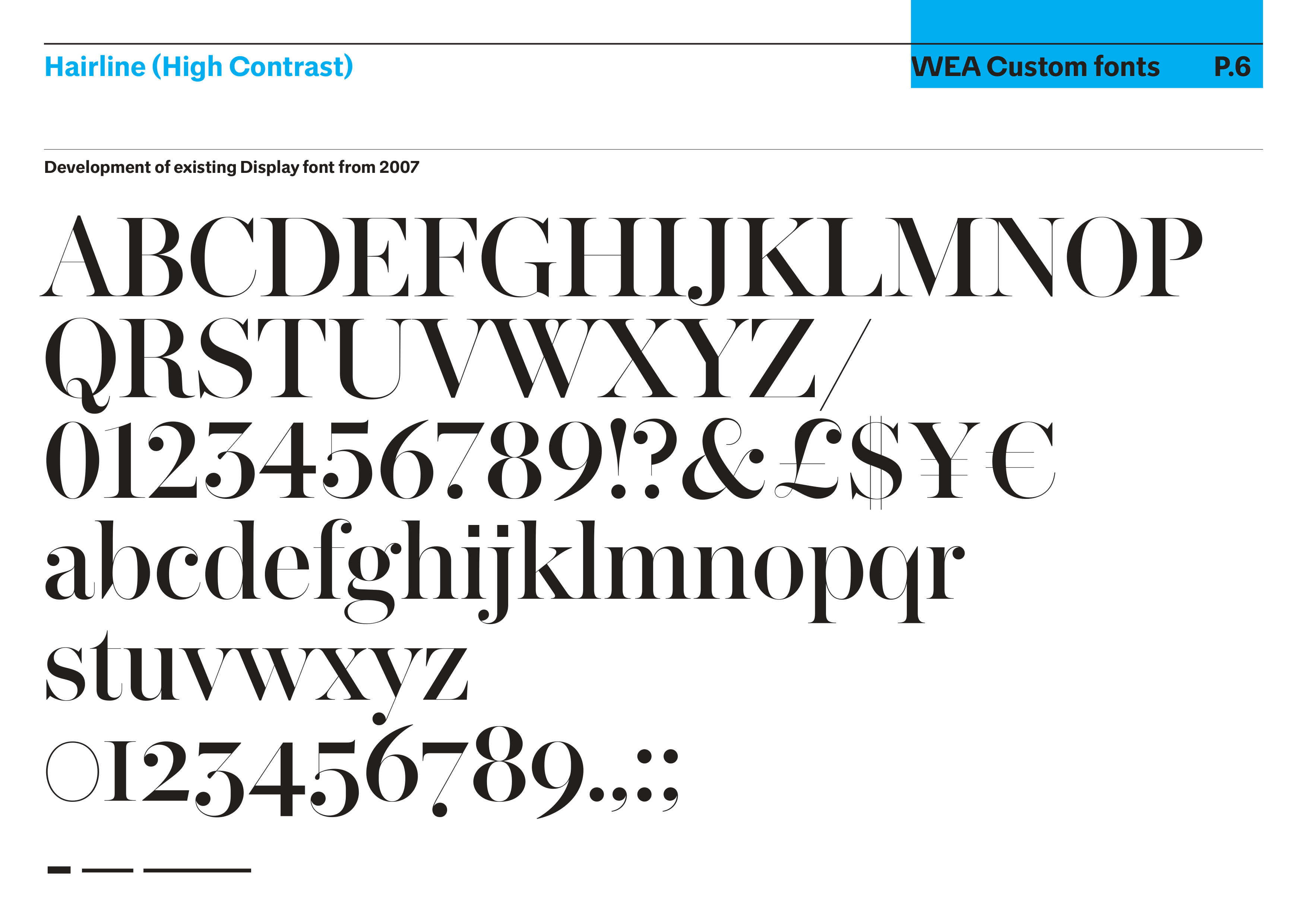
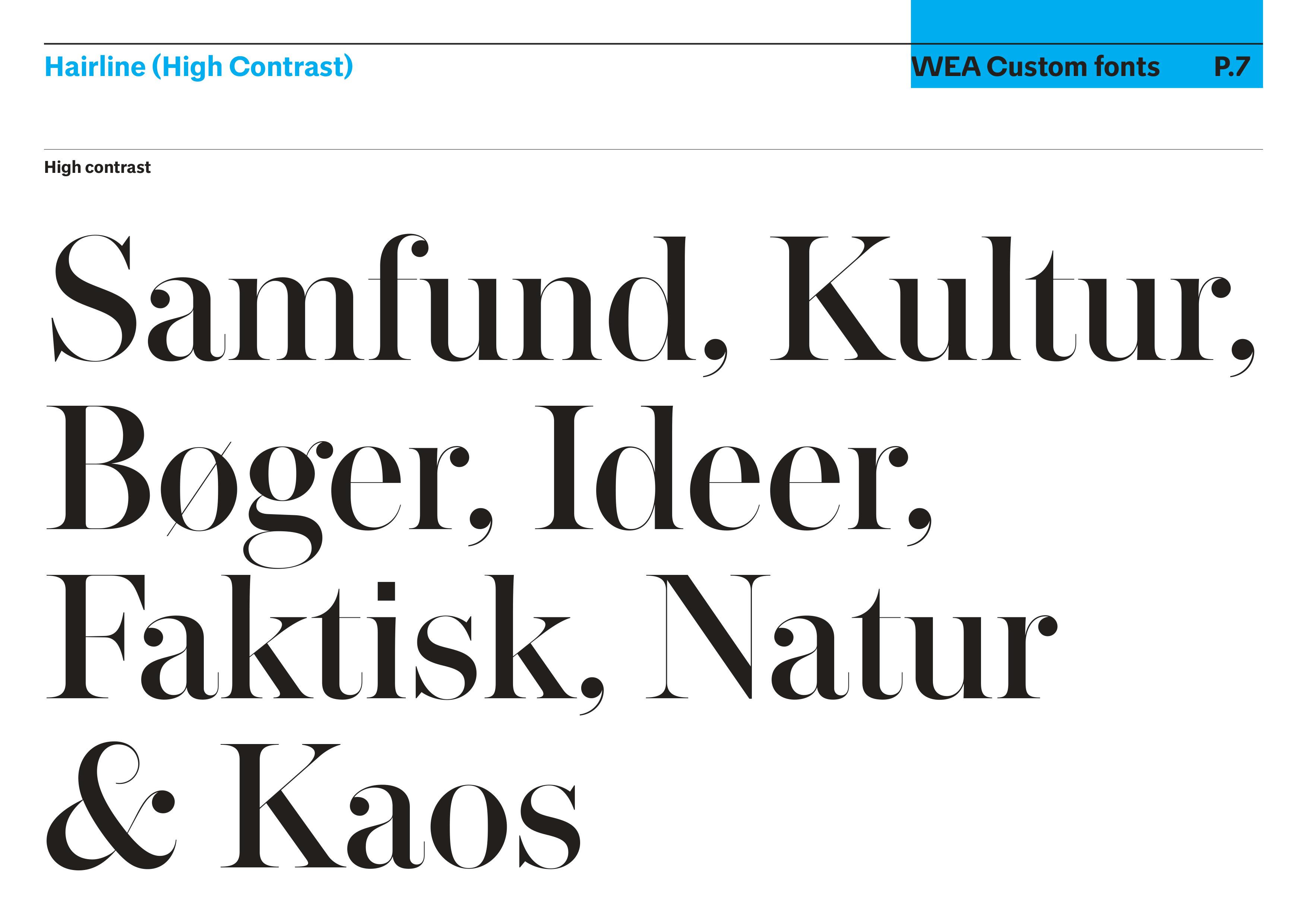
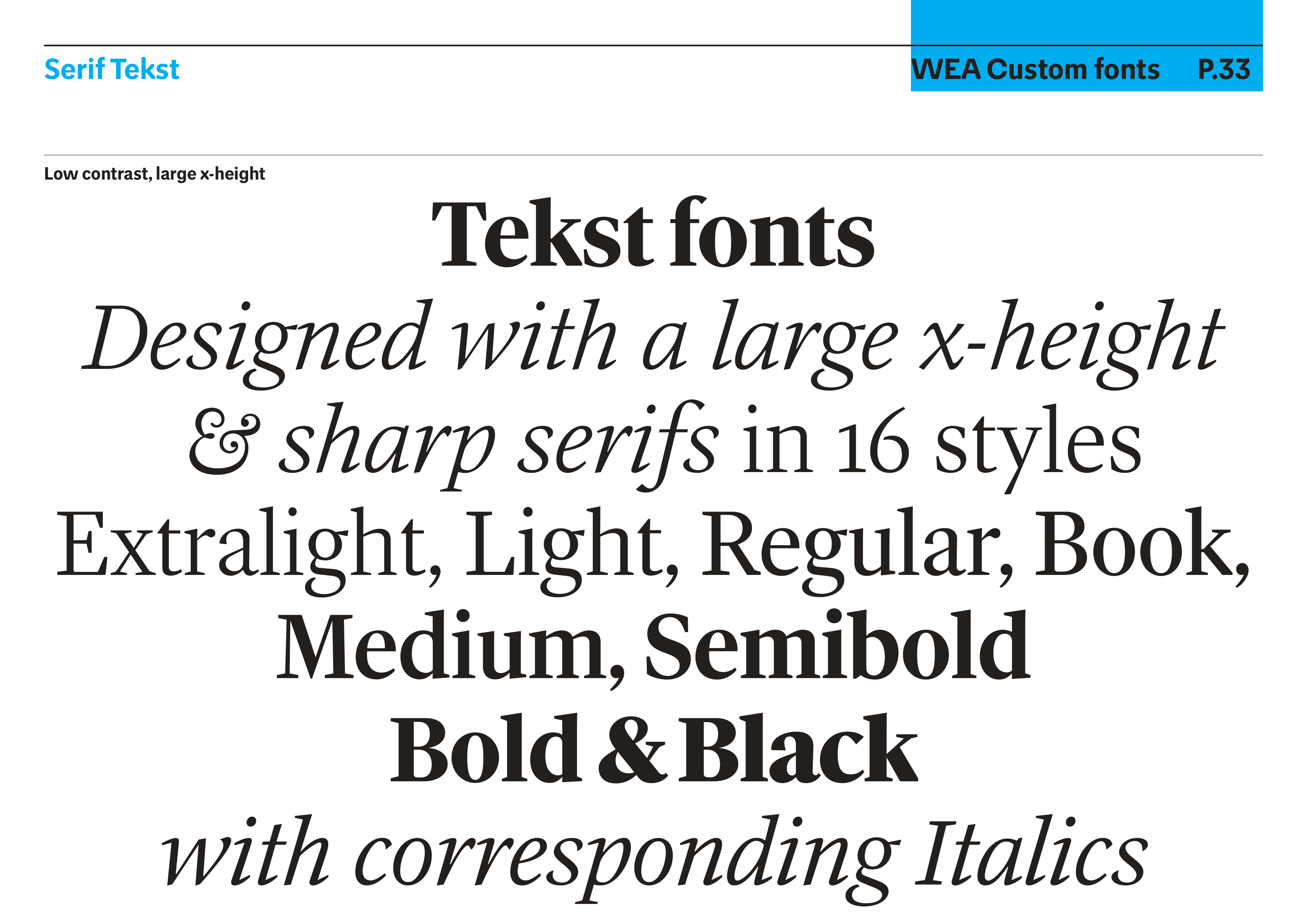
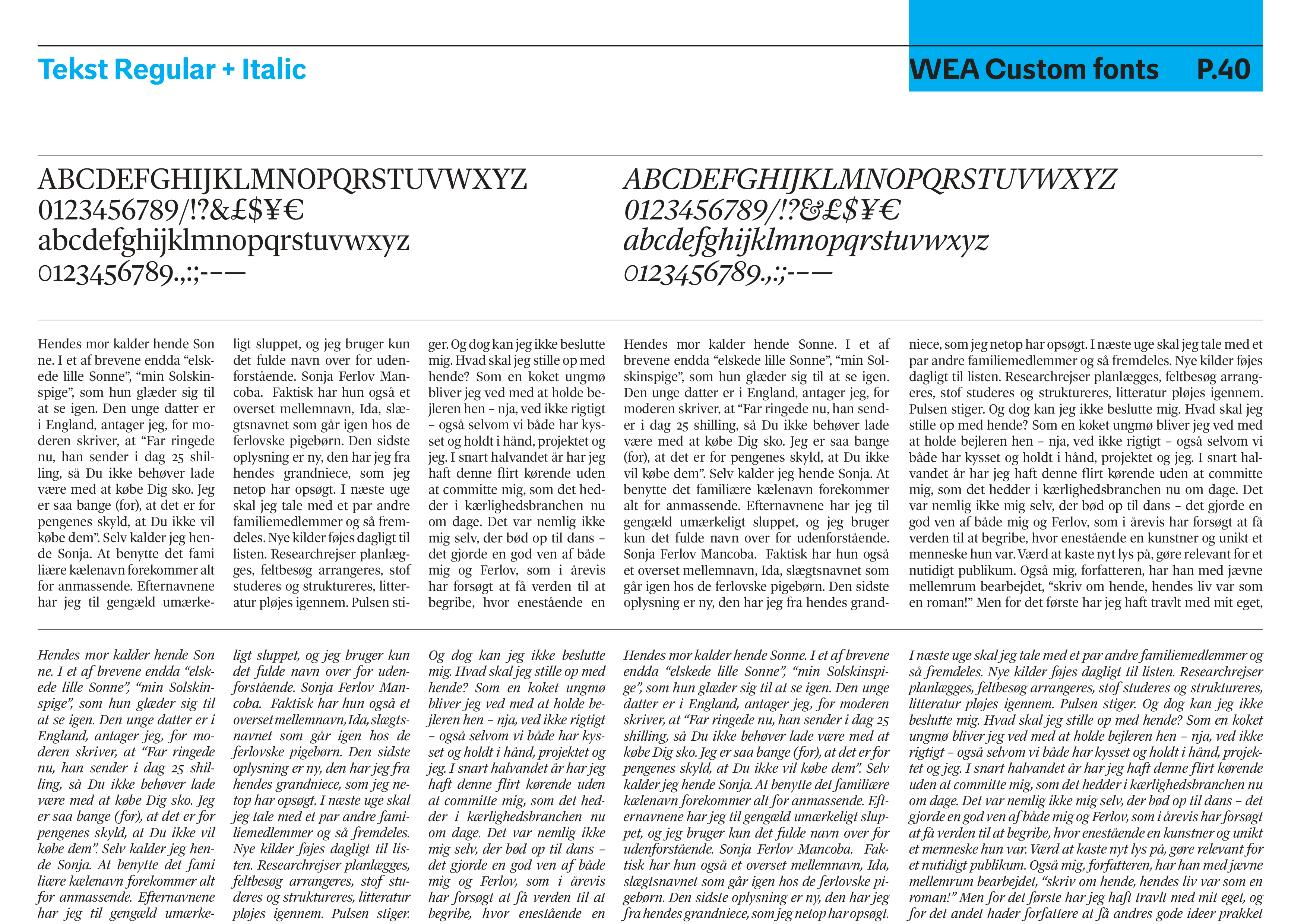
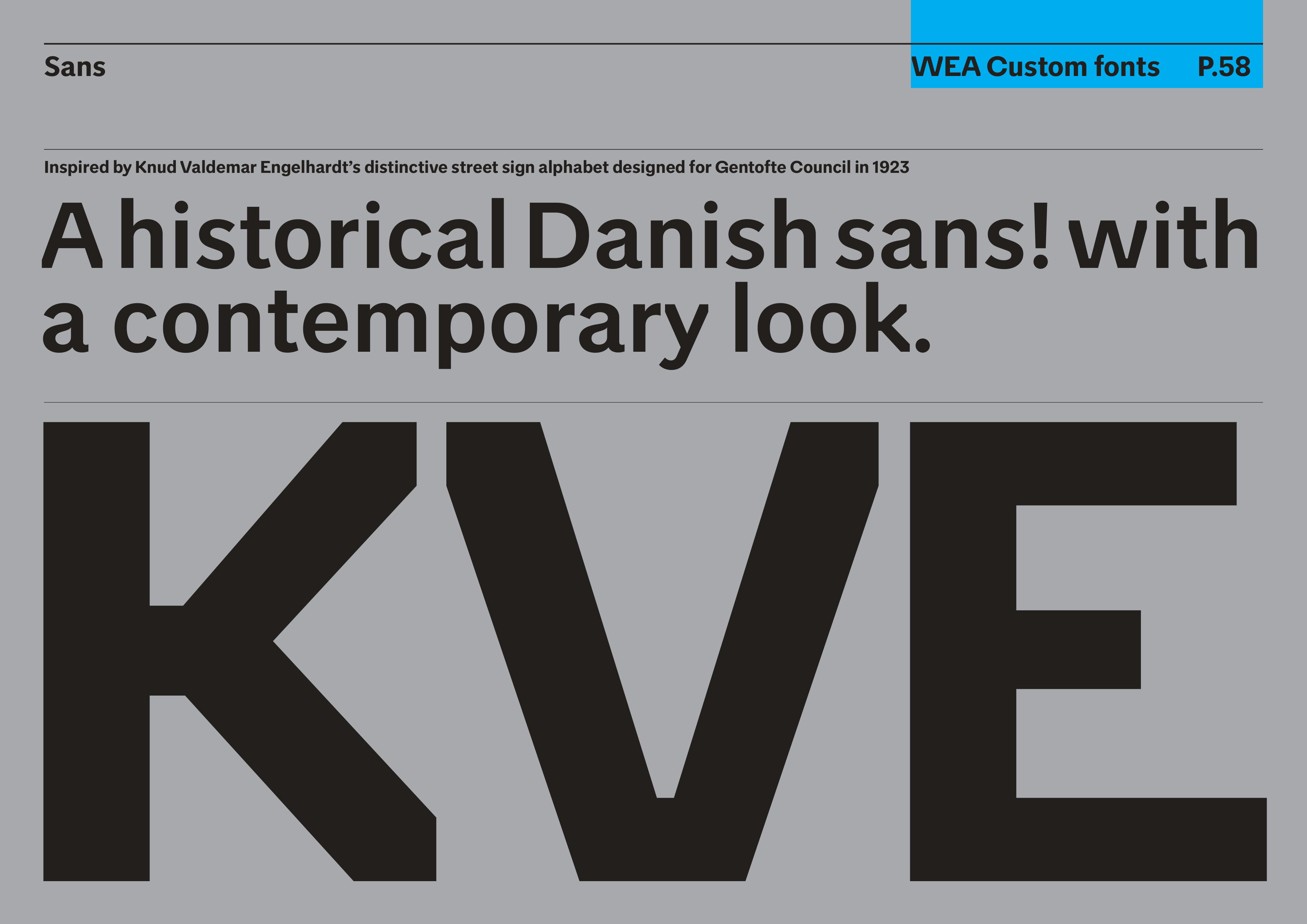
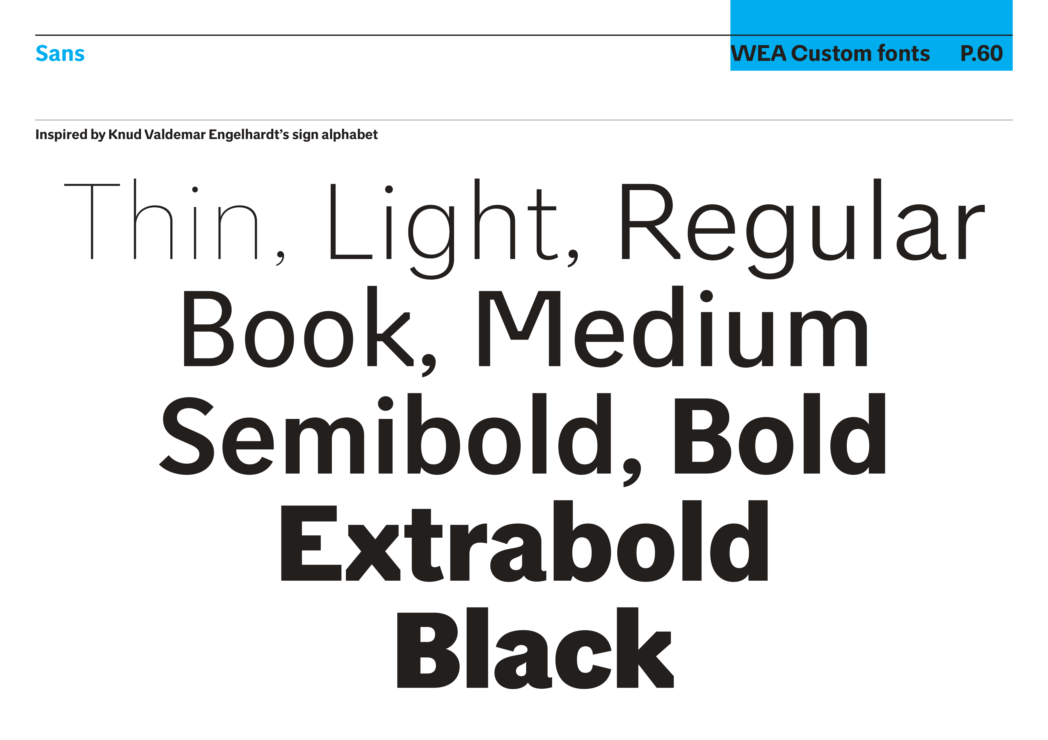
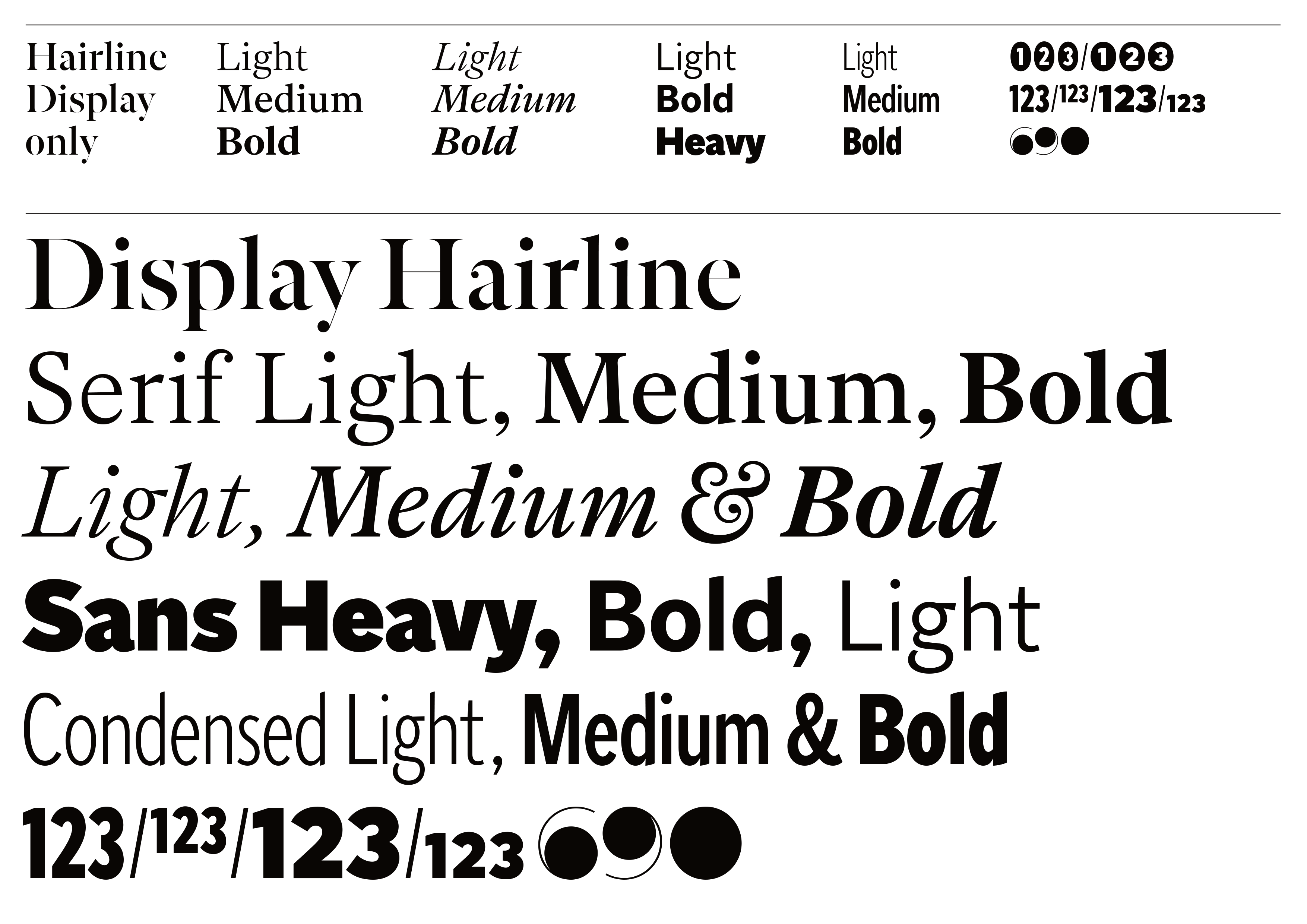
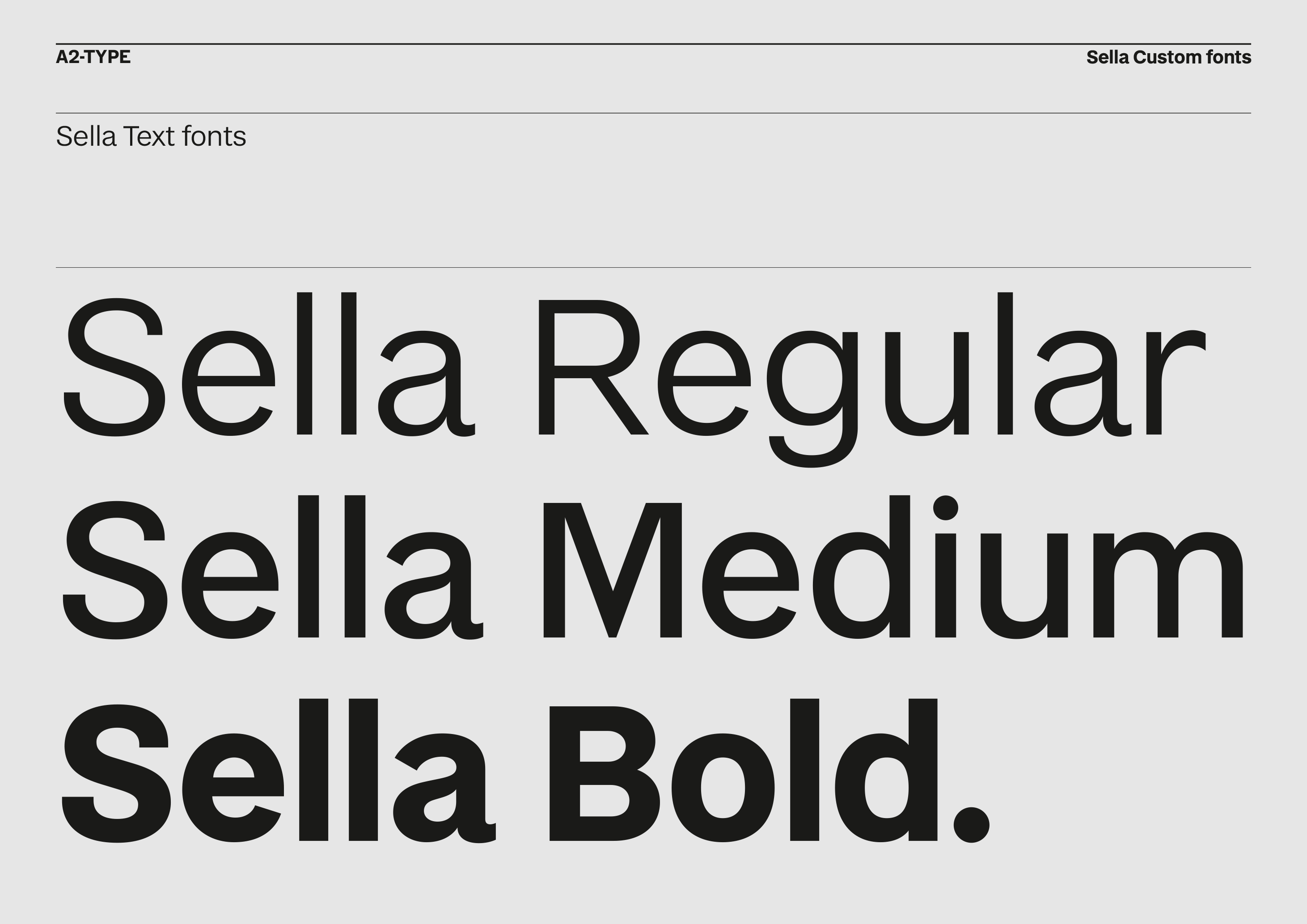
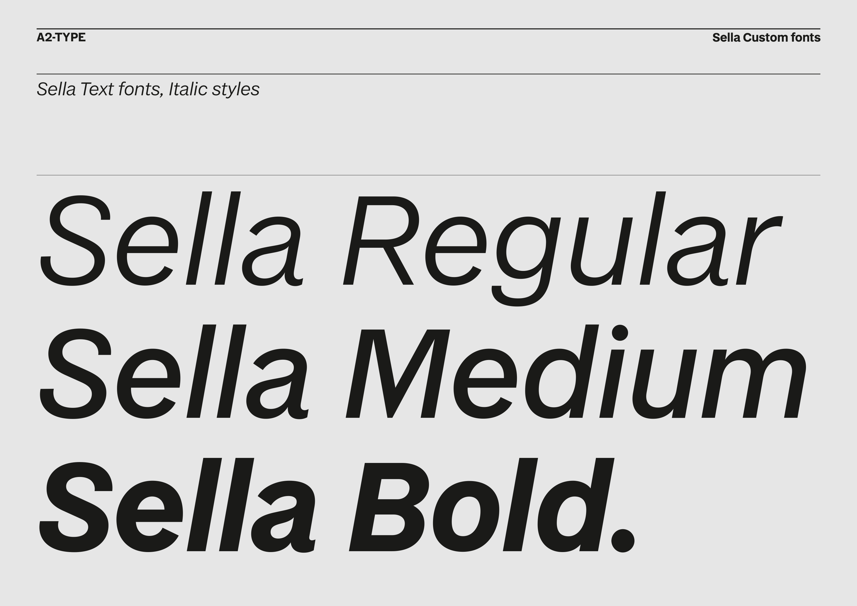
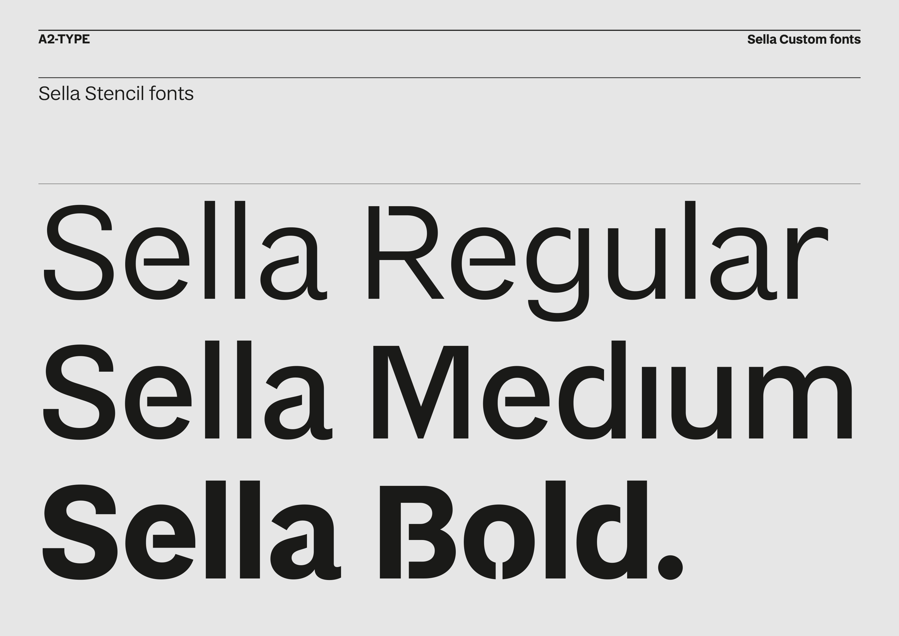
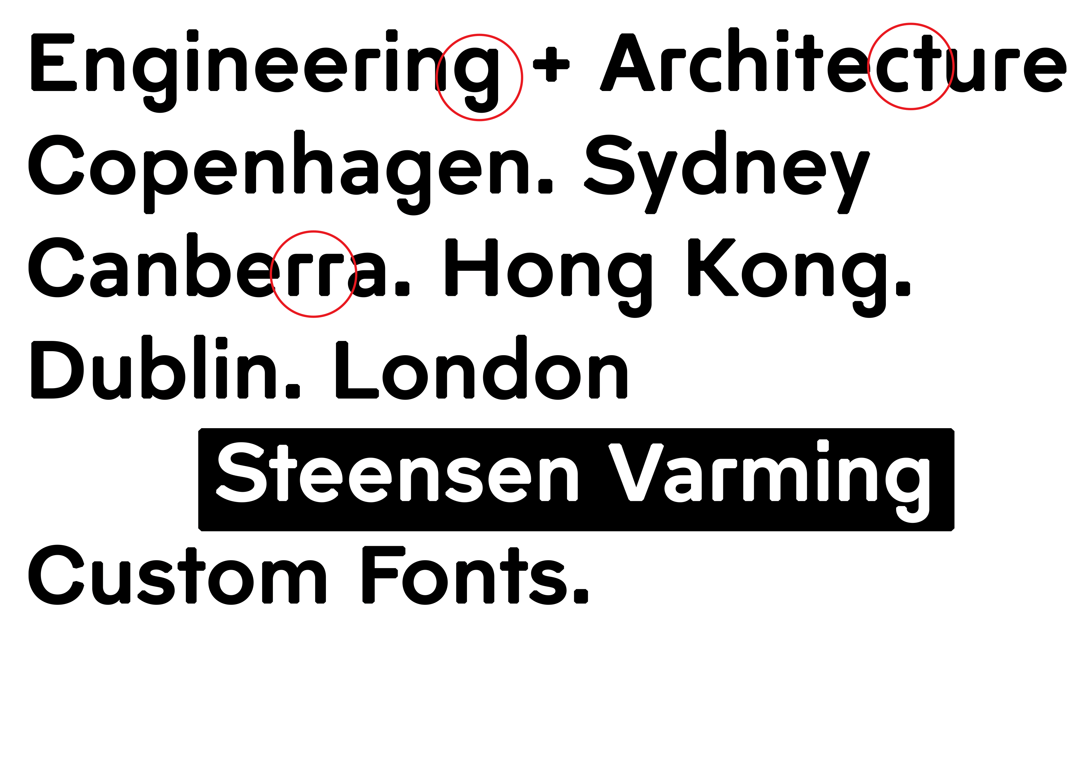
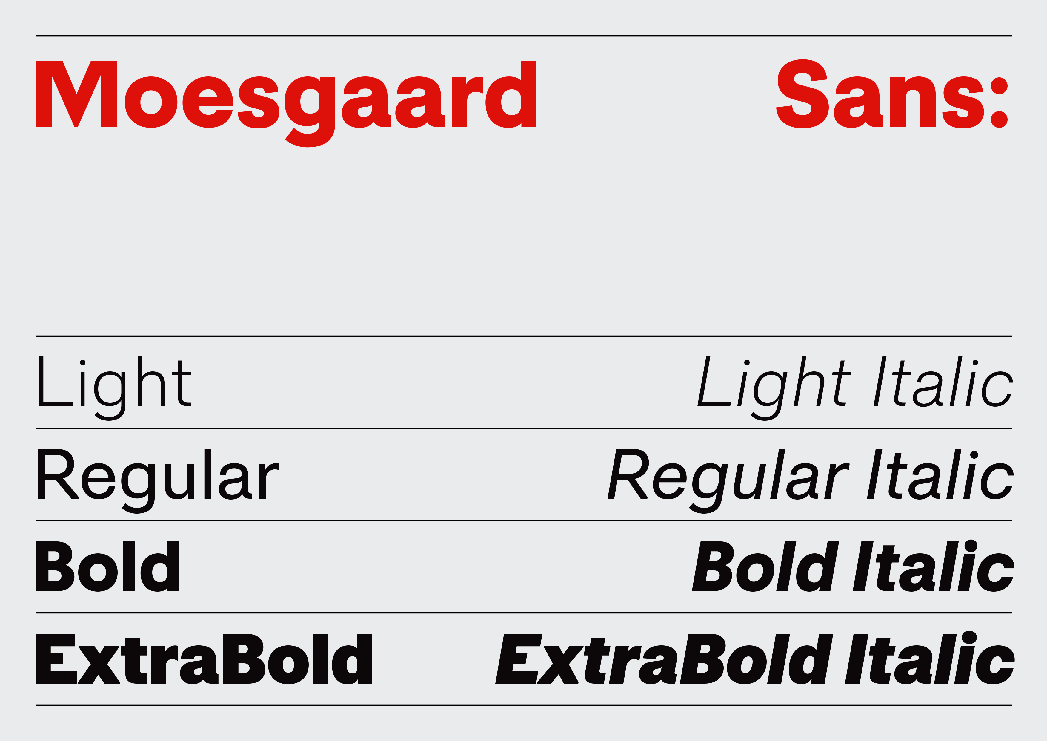
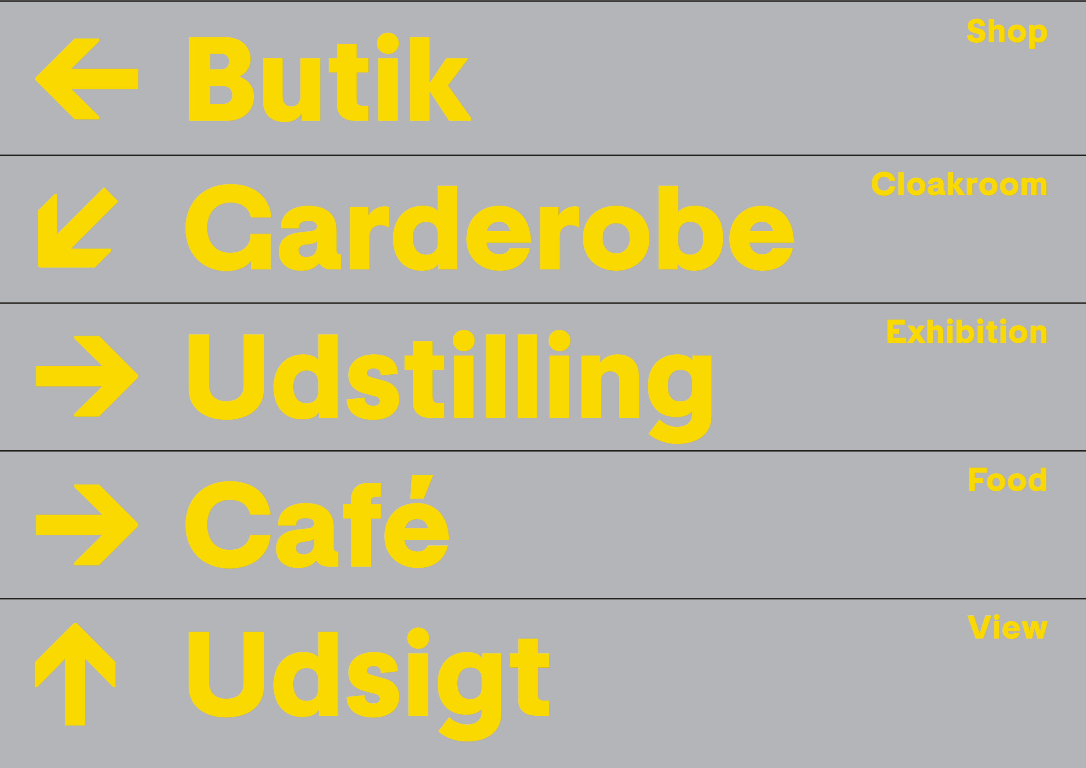
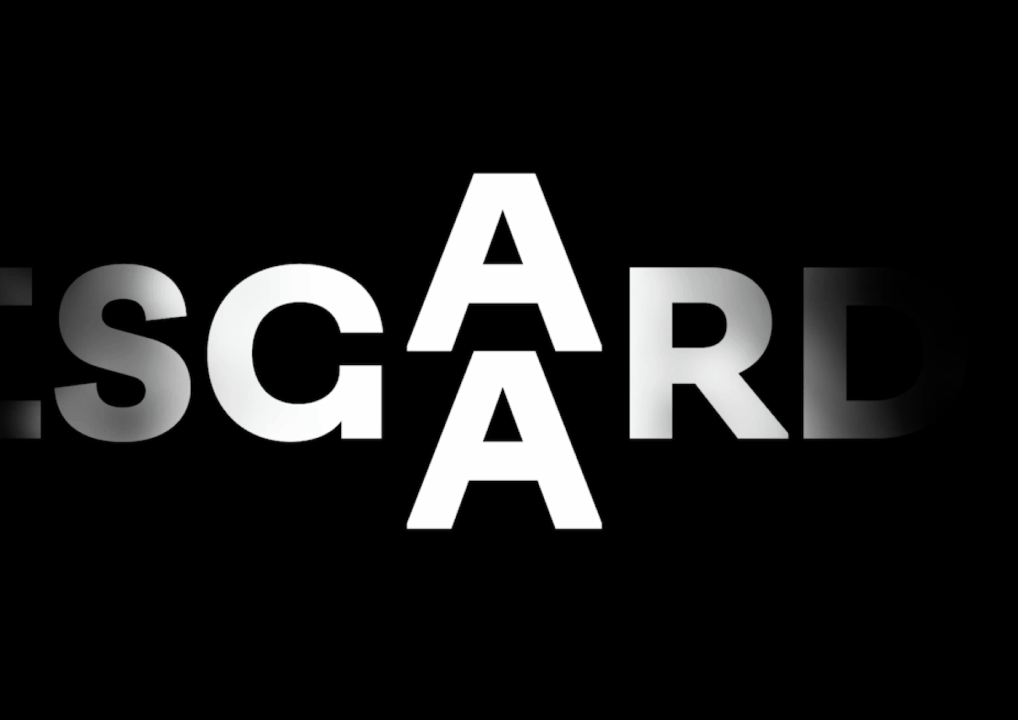
Strategy, logo, custom fonts, colour scheme, brand design, and templates designed in collaboration with the museum and our long-time collaborator, brand designer, and strategist, Katinka Bukh (Weekendavisen, Sermitsiaq). Moesgaard Museum is a Danish regional museum dedicated to archaeology and ethnography. It is located in Beder, a suburb of Aarhus, Denmark. Moesgaard cooperates with the Institute of Prehistoric Archaeology, Medieval and Renaissance Archaeology and Anthropology at Aarhus University. The main part of the museum’s archaeological collection is of Danish origin. In addition, the Ethnographical Collections contain almost 50,000 artefactsfrom all over the world. The collection also contains photographic material, films and sound recordings. The museum’s exhibitions present several unrivalled archaeological findings from Denmark’s ancient past, among others the Grauballe Man, the world’s best preserved bog body and the large ritual weapon caches from Illerup Ådal, testifying the power struggles and warfare of the Iron Age. The museum building is designed by Henning Larsen Architects.

The Economist Group

New logo and custom fonts for The Economist Group

We created a suite of interconnected and complimentary typefaces (sans, serif, headline) for The Economist. The fonts not only give voice to the journalism but also support the presentation of a wide-ranging set of data, from facts to figures, charts, and graphs, and scientific and mathematical equations.

The typefaces draw on the rich legacy of the newspaper’s 180-year history, pulling inspiration from early editions. The serif references the Economist’s use of Plantin, but rather than creating a Plantin revival, the inspiration goes further back to Robert Granjon’s original 16th-century drawings. The inspiration for the sans looks back to Bauer’s Venus, a typeface popular in early 20th-century advertising and a favourite of Romek Marber, The Economist’s cover designer during the 1960s. The headline sans, for covers only, has its origin in a variety of industrial condensed sans typefaces found in our print archive. The project was directed by Stephen Petch (Art Director), Adam Morris (Head of Product Design and UX), and Mark Mitchell (Principal Product Designer for The Economist). Selected as ‘Prize Nominee Work’ at the Tokyo Type Directors Club Awards 2025.

Sermitsiaq

Logo design as part of rebrand by Studio Katinka Bukh for Mediehuset Sermitsiaq in Greenland

The goal of the project was to bring together the two newspapers, AG and Sermitsiaq, under one common digital platform and transition to a more efficient bilingual publishing flow in a new and financially sustainable CMS. As well as avoiding a hybrid logo where the names of the two newspapers had been drawn together. The idea was to draw on the visual expression from Greenland’s oldest newspaper, Atuagagdliutit (now AG), founded in 1861, and combine it with the classic style from Sermitsiaq , established in 1958 and named after the iconic saddle-shaped mountain outside Nuuk. We drew a modern version of the historically distinctive woodtype typography for a new logotype and thus created the iconic ‘S’ as a symbol for the media house. The new identity stands out clearly - has lots of distinctive features, which ensures durability and recognisability. 

The King's Trust

Namemark + Custom fonts for His Majesty King Charles III’s Kings Trust

New logo and custom fonts project, led by James Sommerville of KnownUnknown. Our role was to provide typographic expertise and to craft a new namemark for The King’s Trust, including the design of a custom suite of fonts for use across all touchpoints. We designed two typefaces: 1976 Condensed for headlines (a single weight in caps only) and 1976 Sans (a 5-weight font family) for wider branding usage. Read more about The King’s Trust here

The Philadelphia Inquirer

Custom fonts for Luke Hayman’s (Pentagram, New York) redesign of The Philadelphia Inquirer. We designed a suite of new fonts consisting of Headline, Text, and Low contrast text fonts for web.

Founded in 1829, The Philadelphia Inquirer is the third-longest continuously operating daily newspaper in the US. With a mission of “asking on behalf of the people”, The Inquirer provides essential journalism for the diverse communities of the Philadelphia region and has won 20 Pulitzer Prizes. To help reach a growing audience, Pentagram has redesigned The Philadelphia Inquirer, improving the reader experience and modernising the paper’s processes. This major update — the first in nearly 30 years — is part of the Inquirer’s new editorial, design, and operations strategy across its multiple brand platforms. Read full case study here: https://www.pentagram.com/work/the-philadelphia-inquirer/story

Network Rail

Custom signage typeface designed for all stations across Network Rail. Network Rail approached us to create a new custom typeface that related to the original Rail Alphabet from the 1960s whilst also working seamlessly in today’s environment, including the new wayfinding and pictogram system designed by Spaceagency.

The new system of signs, pictograms, and typography has a lighter typographic voice than the signs from the 60’s and is far more readable than the current dark blue signs with reversed out type. The design process was one of collaboration; Margaret Calvert would draw by hand, and we would work on-screen. With input from Network Rail, Spaceagency, and station architect WestonWilliamson+Partners, we arrived at Rail Alphabet 2, a highly legible and modern typeface with a clear historical lineage.

Rail Alphabet 2 is a comprehensive typeface consisting of 7 fonts: a special weight designed for signs, with three font styles, including Italics, crafted for print, online, and mobile. Rail Alphabet 2 has sharp junctions and slightly narrower proportions than the original Rail Alphabet. The project was featured in the exhibition ‘Margaret Calvert: Woman at Work’ at the Design Museum, 21 October 2020 – 22 August 2021. All images © A2-TYPE + Spaceagency. ‘Certificate of Typographic Excellence’ in the 24th Annual Type Directors Club, NYC Typeface Design Competition.

​Moscow Metro

A custom font in four grades, plus a set of 40+ unique pictograms created exclusively for Moscow Department of Transport.

The custom font and pictogram system was art directed and designed by A2–TYPE, Scott Williams & Henrik Kubel, with Margaret Calvert as type and pictogram consultant. Cyrillic script designed in collaboration with Ilya Ruderman. The project was commissioned by City ID and Moscow Department of Transport, DOT. The wayfinding system was designed by City ID. View more images here

Qantas Airlines

Custom alphabet in capitals only for Qantas Airlines, 2017. Commissioned and art directed by Houston Group. See more about the project here.

Qantas Airways is the flag carrier of Australia and its largest airline by fleet size, international flights, and international destinations. It is the third oldest airline in the world, after KLM and Avianca, having been founded in November 1920; it began international passenger flights in May 1935. The Qantas name comes from “QANTAS”, an acronym for its original name, “Queensland and Northern Territory Aerial Services”, and it is nicknamed “The Flying Kangaroo”.

The Athletic

An Inline custom typeface for the coolest brand in sports journalism. Based on our original font, Regular Slab, we designed a new inline version for the Athletic brand. The project was commissioned by Gretel in NYC and conceived in collaboration with their design team.

The Inline typeface is complimented by our Regular Slab Bold typeface, used by The Athletic across their entire brand. Read full case study here. All images © Gretel NYC. About the client: The Athletic is a subscription-based sports website that provides ad-free national and local coverage in 47 North American cities as well as the United Kingdom. The font is now available for commercial licensing. Please enquire for a license.

​GOV.UK

New Transport typeface in 2 weights, Light and Bold, developed in collaboration with Margaret Calvert for use on all UK Government websites.

The November issue of Creative Review includes an extensive feature on the GDS and their work. Read more here: Creative Review Blog feature. www.gov.uk

Weekendavisen

Custom fonts for Danish Weekly Weekendavisen. Broadsheet newspapers are becoming rare these days. What is rarer is it to be commissioned to draw custom fonts for such a newspaper. Please welcome the beautiful redesign of Weekendavisen, the Danish weekly, published since 1749.

We are proud to reveal our new font system for Weekendavisen – drawing inspiration from Danish typographic history (Knud Valdemar Engelhardt and Gunnar Biilmann Petersen), we designed WEA Display, Sans, and Serifs fonts for all aspects of the newspaper. We also redesigned the Masthead and faithfully restored the Berlingske crest, after Biilmann Petersen’s original design, in collaboration with Martin Mörch (master engraver). The newspaper is expertly and beautifully art directed by Design Director Katinka Bukh and her talented in-house design team. Here is a great introduction and explanation of the redesign by Bukh (if you read Danish). Editor-in-chief Martin Krasnik gives a great introduction to the redesign here! (please use Google translate if you want to read it in English). Our custom fonts won a Tokyo Type Directors Club Prize in 2021, and the newspaper was named World’s Best Designed in the 42nd best of Print News Design Competition 2021 by SND. The fonts are now available for commercial licensing, bar any Danish news media.

The New York Times Magazine

We designed a large suite of custom fonts for one of the world’s most admired publications, The New York Times Magazine. Read the case study here: Behind the Relaunch of The New York Times Magazine.

Sans, Slab & Serif – each font category has a different starting point and set of references. The starting point for the Serif font is the Stephenson Blake Garamond-like metal typeface Mazarin, also known as ‘Astree’ from French foundry Deberny & Peignot. Another influence was The New York Times Magazine original masthead, although this is a Blackletter type, its sharpness and contrast have infused our design, most noticeably in the Display and Headline fonts. The Serif fonts designed for text settings share some of these features, although the proportions, contrast, and details have been crafted anew to aid legibility in smaller point sizes. The Slab fonts used in the magazine for pull quotes and headlines are a continuation of their existing Stymie font, but in a condensed form and with added typographic personality. The Sans fonts are linked to the Industrial Grotesque types, with metal type versions of Futura and Akzidenz as loose models for inspiration, all reinterpreted and designed to suit the magazine. The fonts are now available for commercial licensing. The font system won the prestigious Tokyo Typo Directors Club ‘Grand Prix Award’ in 2016.

NYTMag Olympics Issue

Custom font in one style for The New York Times Magazine Olympics Issue.

A mono-width font crafted to work only when stacked! Read the background story about the design and thinking of the whole issue on FormFiftyFive and on Magculture. The typeface won the prestigious 2019 TDC Prize from Tokyo Type Directors Club! The font is now commercially available.

Additional credits:
Editor in chief: Jake Silverstein
Design director: Gail Bichler
Art director: Matt Willey
Director of photography: Kathy Ryan
Contributing Photo Editor: Kristen Geisler

The New York Review of Books

The New York Review of Books. Masthead + Custom fonts for Matt Willey’s (Pentargam) re-design of this NYC finest publication

Redesign of The New York Review of Books by Matt Willey, pentagram. Typefaces, NYRoB Figgins and NYRoB Century, by A2-TYPE. Art Editor: Leanne Shapton. Artworking and typesetting: Lisa Naftolin, Will Simpson and Kazue Jensen.

​The Independent Newspaper

Bespoke fonts for the UK daily newspaper The Independent.

We designed a series of fourteen interconnected fonts. All the fonts have large character sets, several number systems, and stylistic features to serve all aspects of the newspaper and associated magazines and publications. Winner! Yellow Pencil from the D&AD Global Awards Scheme, 2014. The fonts are now commercially available, click here to see details. Read more on Creative Review’s Blog. The typeface was awarded a ‘Yellow Pencil’ from D&AD in 2014, and the ‘Typeface Design Prize’ at the prestigious Tokyo Type Directors Club awards in 2015.

LINKEDIN

Multiscript custom fonts for LinkedIn

A four-year project with multiple stakeholders. Based on our distinctive ‘Regular’ typeface we designed a comprehensive font program for the global brand LinkedIn. The project comprise Sans and Slab styles including a special set of fontsengineered for web use only. The fonts were named ‘Community’. Supported languages: Extended Latin, Cyrillic, Arabic, Chinese, Japanese, Korean, Thai, Devanagari. Commissioned by Wollf Olins, San Francisco, 2018—2021. The fonts are now available for commercial licensing.

Arne Jacobsen

Design of a unique alphabet in 2 styles, Regular and Bold, for the world famous Danish architect and furniture designer Arne Jacobsen. The typeface is based on the Aarhus town hall alphabet designed for signage by AJ himself and Erik Møller ca. 1941.

A2-TYPE restored the original capital letters, added a sympathetic lowercase style, expanded the overall character set, and added extra weights. The typeface features on all communications across all platforms, analogue and digital, and is exclusive to the Arne Jacobsen brand. The project was commissioned by the Board of Arne Jacobsen and Arne Jacobsen’s Grandson, Tobias Jacobsen, as a separate integrated design tool of the overall brand design by Danish agency AM. Read more about Arne Jacobsen here.

The Queen of Denmark

We are proud to announce that we co-designed the official logo(s) for Her Majesty the Queen of Denmark to mark the celebration of her 80th birthday in April 2020.

The two logo’s will occupy their own space. The ‘monogram’ version will be used for HM the Queen’s private celebrations at the castle. The ‘fireworks’ version of the logo, along with the associated portrait of HM the Queen, will be used for all media purposes.

Client: Wonderful Copenhagen
Director of Communications: Tine Kastrup-Misir
Agency: Punktum Design
Design: Søren Varming & Henrik Kubel
Typeface: Custom version of Biilmann from A2-TYPE
Portrait photo by Per Morten Abrahamsen
kongehuset.dk

Eurosport Pyeongchang 2018

Design of a custom headline font system based on our New Grotesk Square typeface for the Eurosport 2018 Pyeongchang Olympic on-screen identity designed by DixonBaxi.

The font system comprises a unique condensed Headline font in 3 solid and matching outline styles. The fonts support both Latin and Cyrillic scripts. Animation / Film by DixonBaxi. Read about the project at Creative Review blog. Images courtesy of DixonBaxi and Eurosport. The project was awarded a Gold Clio, 2018.

CNN

Custom stencil font in 2 grades with Italics crafted exclusively for CNN STYLE.

View the fonts in full effect on the CNN STYLE’s beautifully designed RIBA, Royal Institute of British Architects International Prize website: RIBA, International Prize showcasing 6 spectacular buildings from 6 countries. The fonts are now available for licensing. Please enquire (email us directly).

Banca Sella

A custom font system for Italian Bank Sella. Commissioned by, and designed in collaboration with, our friends at renowned Italian design studio Tassinari/Vetta.

A2-TYPE delivered a suite of custom fonts comprising of a sans in 3 weights: Regular, Medium, and Bold, with accompanying Italics, plus a set of unique Stencil fonts. The origins of Gruppo Banca Sella has its roots in 1886, when Gaudenzio Sella, inspired by the principles of his uncle Quintino Sella, along with six other brothers and cousins, founded in Biella the Gaudenzio Sella & C.

Qualcomm®

Design of custom fonts and crafting of wordmark for Qualcomm. Commissioned and art directed by Interbrand, New York, 2017.

Qualcomm is an American multinational semiconductor and telecommunications equipment company that designs and markets wireless telecommunications products and services. The company headquarters is located in San Diego, California, United States, and has 224 worldwide locations. Qualcomm’s wholly owned subsidiary, Qualcomm Technologies, Inc. (QTI), operates substantially all of Qualcomm’s R&D activities, as well as its product and services businesses, including its semiconductor business, Qualcomm CDMA Technologies.

Design Museum Logo

New identity and logo designed and commissioned by Studio Fernando Gutiérrez.

The logo was redrawn and carefully crafted by A2-TYPE to work on all of the Museum’s touch points and media.

Evening Standard Newspaper

Design of a new masthead plus an extensive suite of bespoke fonts for the Evening Standard newspaper. Working in collaboration with the Evening Standard’s art director, Nick Cave, and newspaper consultant, Colin Wilson, we designed a large, interconnected system of custom fonts to work across the printed newspaper and all associated media platforms.

The bespoke font system named ‘Standard’ comprises Serif Text, Serif Display, Sans, Sans Condensed, and Sans X Condensed, with a special Serif Headline font for use on the front page. 43 font styles in total! Quote from Editor, George Osborne: “… the average age of the Standard print reader is 36 – which is many decades younger than most newspapers these days”. A paper, he says, is “still a very convenient, easy to digest and with this redesign easy to navigate way of receiving information about politics and business and culture and celebrities”… Read full interview about the redesign here. The Evening Standard’s daily print run is around 850,000 copies. The paper is distributed for free on all London streets and UK Rail networks. Additional design credit: The new Eros figurine in the Masthead was drawn by Illustrator Christian Adams. The fonts are now available for commercial licensing.

es Magazine

Masthead for Evening Standard weekly magazine

Design of ‘es’ logo / masthead for use on all magazine covers accompanied by our A2 Standard typefaces designed previpously for the Evening Standard newspaper.

The Sunday Times Magazine

Masthead design and custom cut of our Register* typeface for The Sunday Times Magazine, UK.

The Sunday Times magazine expertly mixes the delicate serif font used for headlines and text matter with another of our fonts, the robust and friendly-looking New Grotesk Round. Commissioned by Esterson Associates and The Sunday Times Magazine as part of their extensive redesign and editorial reimagining of the title in the summer of 2016.

​Android

Google Android. Design of custom font(s) system.

andyou
andthem
andwhynot
andtwins
androadtrips
andhugs
andweekends
andsamsung
andaudi
android
be together. not the same
View AD film featuring the fonts here

​Steensen Varming

Custom fonts for leading independent consultancy with unrivalled expertise in mechanical and electrical building services, lighting design, and sustainable design. Steensen Varming was founded in 1933 by Niels Steensen and Jørgen Varming.

The grandson of one of the founders, Søren Varming, of Punktum Design in Copenhagen, commissioned us to co-develop a new brand identity, including the design of a suite of custom designed fonts. After 10 years of exclusivity, the fonts are now available for commercial licensing.

​A23D Letterpress Alphabet

Commissioned by New North Press in London to add to their collection of wood and metaltype.

A23D is available for use at New North Press’s letterpress workshops. Filmmaker Adrian Harrison has made a film about the project, which premiered at the V&A, as part of the London Design Festival. A23D won a coveted TDC Typeface design award from New York Type Directors Club. Watch the movie here. The digital artwotk (fonts) are available from our foundry, just drop us an email.

0

Fonts

You have no items in your cart.

Subtotal £0.00
Checkout